Intro to the new ConstraintLayout in Android
Last week, also during the Google I/O conference, Google introduced a new set of tools for Android developers. Among them is a new Layout editor and a new layout called the ConstraintLayout. The ConstraintLayout was said to be a new tool to empower developers create very flat ui-hierarchies for their complex layout.
I’ve been playing around and exploring the new thing and I’ll summarize my findings in this post.
To be able to access these new features, you need to be running Android Studio 2.2 Preview and Java 8. You can head over to the canary channel to download it. Be sure to run it in parallel with your stable version. It’s still in Preview!
Layout Editor & Constraints Overview.
The new layout editor in Android Studio 2.2 Preview is specially built for the ConstraintLayout. You can specify the constraints manually, or automatically reference within the layout editor.
Overview of Constraints?
A constraint is the description of how a view should be positioned relative to other items, in a layout. A constraint is typically defined for one or more sides by connecting the view to:
- An anchor point, or another view,
- An edge of the layout,
- Or An invisible guide line.
Since each view within the layout is defined by associations to other views within the layout, it’s easier to achieve flat hierarchy for complex layouts.
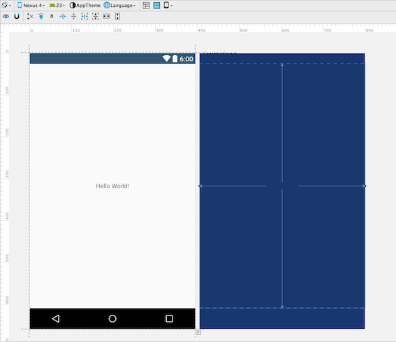
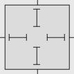
In principle, the ConstraintLayout works very similar to the RelativeLayout, but uses various handles (or say anchors) for the constraints.
-
Resize handle. The resize handle is the
 seen in the corners of the figure above, and it’s used to resize the view.
 - Side handle. The side handle is the
 in the figure above, and it’s used to specify the location of a widget. E.g using the left side handle to always be aligned to the right of another view, or the left of the ConstraintLayout itself.
 - Baseline handle. The baseline handle is the
 in the figure above. It is used to align the text of a view by the baseline of the text on another view.
Getting started with ConstraintLayout
Setup
Ensure that you’re running the AS 2.2 preview, and Android Support Repository version 32 or higher, it’s required before you can use the ConstraintLayout. Let’s get started.
- First, you need to add the constraint layout library to your app’s dependencies within your
build.gradlefile:
dependencies {
    compile 'com.android.support.constraint:constraint-layout:1.0.0-alpha1'
}
- Sync your project.
Add Constraints
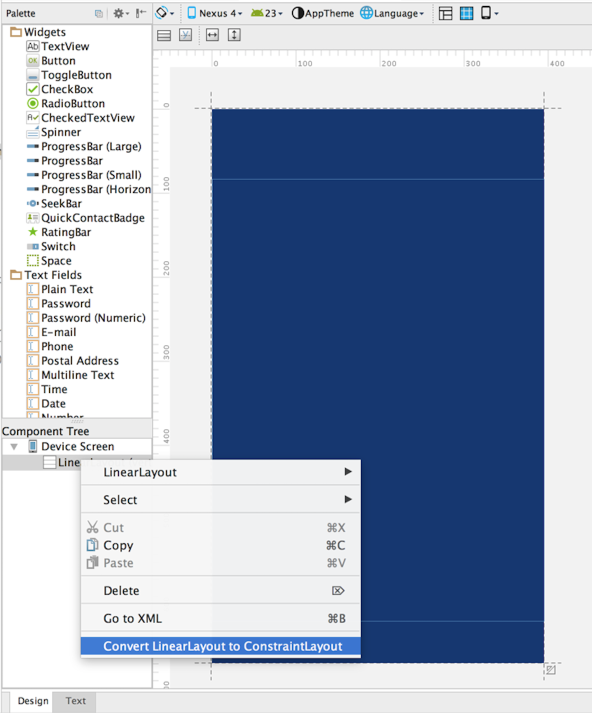
There are typically two ways to create ConstraintLayout in AS. You can create a new XML layout and select the root element to be a ConstraintLayout or convert an existing layout into a ConstraintLayout as shown in the image below:
Once you have the ConstraintLayout setup, what is next is to add the constraints to the views within that layout.
As an example, drag an ImageView to the layout. The new layout builder will immediately ask to add a drawable or resource, select one from the options and press ok.
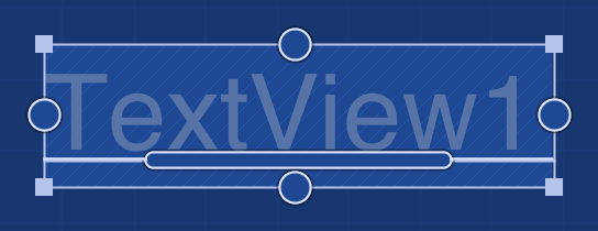
Also drag a TextView unto the layout.
To create a constraint, drag the top side handle on the ImageView to the top of the ConstraintLayout.
You can also drag from the top side handle of the TextView to the bottom handle of the ImageView
Using the Inspector Pane
Now that we’re able to add constraints, we will need to use the inspector. It’s on the right hand side of the layout builder and it lists various properties of the selected widget. Typically, it looks as shown below:
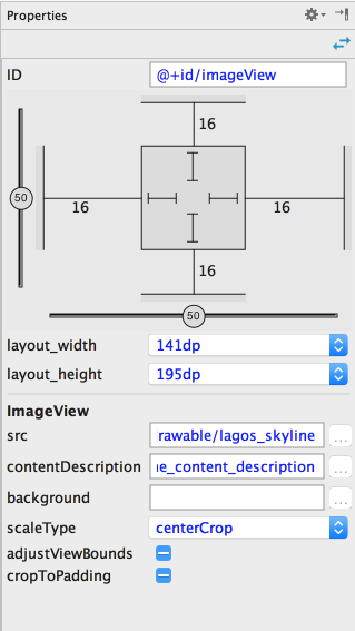
You can use the sliders to move the view by percentage along the x and y axes.
You can also control the dimensions of the view from the inspector pane, by altering the values corresponding to the layout_width and layout_height fields.
Taking a closer look at the square widget on the inspector pane. It contains some more control over the dimensions of the views.
There are other modes of controlling the size of the view. Clicking on the inner lines in the image above help you cycle through the other modes.
-
Fixed mode:
 This allows you specify the width and height of the view.
 -
Any size:
 This mode allows the image to fill up all the space required to fulfill that constraint. You can look at this like “match constraint”
 -
Wrap content:
 This just expands to fill the content of the view. E.g text or image
Using Auto-connect to add constraints.
Autoconnect as the name suggests, automatically creates connections between views/widgets. It tries to create connections to neighboring views/widgets.
To enable autoconnect, look out for the  icon on the top bar of the layout editor.
Last words
This post is not exhaustive of the ways to create and use the ConstraintLayout but it’s meant to just serve as a primer. I will be sharing how to use Inference to create constraints at a later date. I hope you check out the references and further reading for more.
As of today, there isn’t any documentation for ConstraintLayout but I guess it’s in the works. Please check the section below for more info on how to use it.
References and Further reading.
- http://tools.android.com/tech-docs/layout-editor
- https://codelabs.developers.google.com/codelabs/constraint-layout/#0
- http://android-developers.blogspot.com.ng/2016/05/android-studio-22-preview-new-ui.html
If you have comments/suggestions or corrections, please don’t hesitate to drop a comment below :)
Please share if it has helped you get a grasp of the ConstraintLayout.
Cheers.